2022 – UI / Web design
A premium website
for the largest
construction
company in Brazil
2022 – UI / Web design
A premium website for
the largest construction company in
Brazil
My Role
UI Designer – Research, Visual design,
Interaction design
Team
Carla Corrêa (UXW)
Natália Antues (MA)
Rogério Junior (MM)
Fabiana Dias (MM)
Timeline
6 months, launched in February 2023
Overview
Created in 1979, MRV Engineering is recognized as the largest construction company in the country. Focusing on the construction of residential properties, the company has a significant national presence, operating in several Brazilian states.
Problem statement
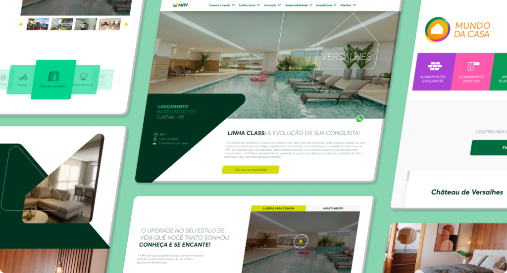
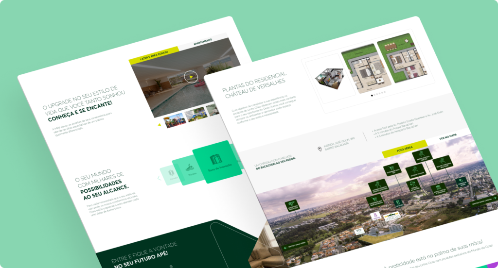
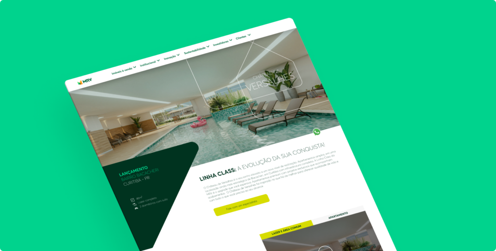
Premium products needed to be highlighted, so it was agreed to create pages with a completely different look of the standard ones. This involved bringing a more sophisticated, elegant and easy-to-navigate look.
Impacts after delivery
Product pages
updated to the
new layout on the company’s official website
pages of a new MRV product called Cidade Sete Sóis were created using my layout as a model.
Updating the code of the old pages delivered more performance to the site.
Main Goals
Create an elegant and attractive website different from MRV’s default pages.
Provide a template that is easily replicable as this will be the new standard for premium websites.
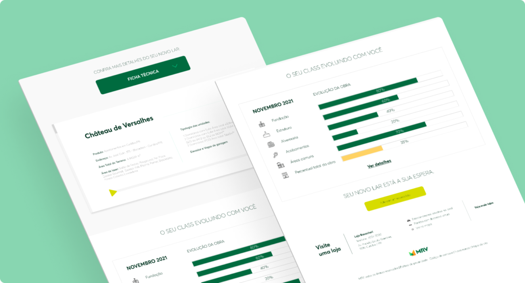
Apply content and information hierarchy that facilitates the visitors get in touch.
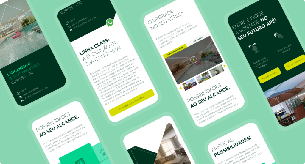
Ensure a great experience for mobile navigation, performing handoff of web and mobile versions.
Navigation structure
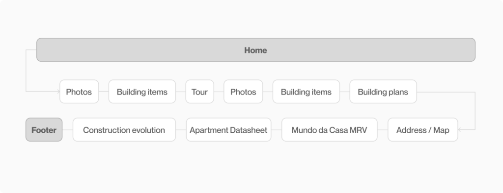
For a better experience, it was agreed to create a one-page website. This way, all information will be accessible by scrolling. Below are the initial items that should appear on the page.
Styleguide
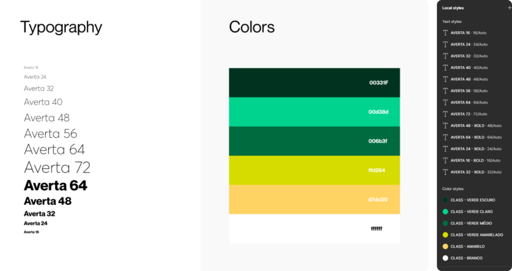
Creating a style guide, even a simple one, always helps me move forward with project ideas more quickly. This way I maintain consistency and visual cohesion while saving time and effort. This guarantees higher quality of delivery.
Website content
Before moving on to project ideations, we had to think about all the text that would go in each section of the website. Carla Corrêa was essential at this stage, she thought about all the content, also bringing ideas for the information hierarchy.
Layout and interactions
It was very important to have these initial processes before starting to work on the layout, because when I reached this stage I already had a good idea of what I would bring as a first proposal.
I kept most of the clickable items in light green, this helps the user know what they can and cannot click, mitigating any kind of frustration or angry clicks.
Proposal approved
The evolved team was already following the construction of content, screens and interactions, so there were no changes to the proposal presented. Only a few minor details needed to be adjusted.
Prototyping and organization
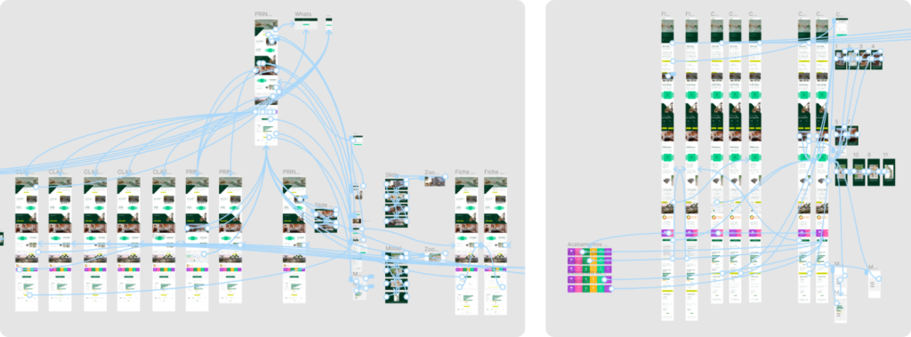
To facilitate the work of the development team, i carried out the necessary prototyping and interactions. This way they visually know what needs to be done (and saves us some meetings).
Handoff process
Part of the process is holding some alignment meetings to deliver the website. There were some details that the development team needed more time to evaluate the technical effort, but overall there were no changes.
Website after implementeds
Before the website was ready, I started working at another company, however, i was very happy after seeing the result of our work ready and online. Alignments meetings (for visual issues, interactions and experience) were very satisfactory.
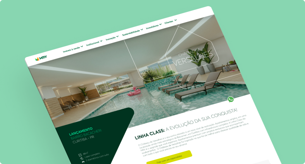
I’ve put some images of the website below after it was launched on the official website:
Some results
After updating the Class products, the layout created became a reference framework in MRV’s marketing sector.
With updated codes, these pages delivered more performance. The same layout structure was used in a new product from the company called Cidade Sete Sóis (Smartcidades MRV).
Learnings & opinions
Imposter syndrome
I remember feeling the impostor syndrome during this work.
Today I understand that this happens to professionals at all levels and a little bit of courage shows us that we are more capable than we think.
Rework
Going straight to the layout will always generate rework. In the case of this website, a good practice was to have the content and research first so we can think about the general hierarchy and organization of each component.
Results
I think it is essential for the designer to keep an eye on the results that came from his work. This helps to quantify and understand the value of your performance as a professional.
Designed by Marcus Martins | 2025 © All rights reserved.
