2024 – Product design

Bringing consistency 

and scalability for 

a payment system

2024 – Product design

Bringing consistency and scalability for a payment system

My Role

 
 UI designer – Redesign, Information
Architecture,
Prototyping, Interaction Design


Team


Henrique Machiavelli, TL

Daniel Martins, UXM
Adalberto Filho, SWE

Tulio Carvalho, SWE
Márcio Rosa, PM


Timeline


3 months, launched in July 2024

Overview


Efí bank is an online payment intermediary that offers billing solutions through bills, payment slips and credit cards.


Also offering services such as Pix, API, Open Finance, Receipt Management, Billing, API Pix and Technology for business management.


Problem statement 


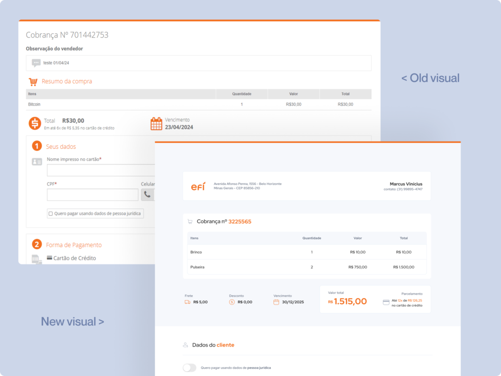
The company had just completed a rebrand (changed name) and system (to v.7), however the payment link flows and the emails were still on v.6.

Impacts e results

Product were convered in this batch of updates

flows (web, tablet and mobile) were designed and delivered

Company and product e-mails have been designed.

Payment link (old version)

Previous version payment link (v.6)
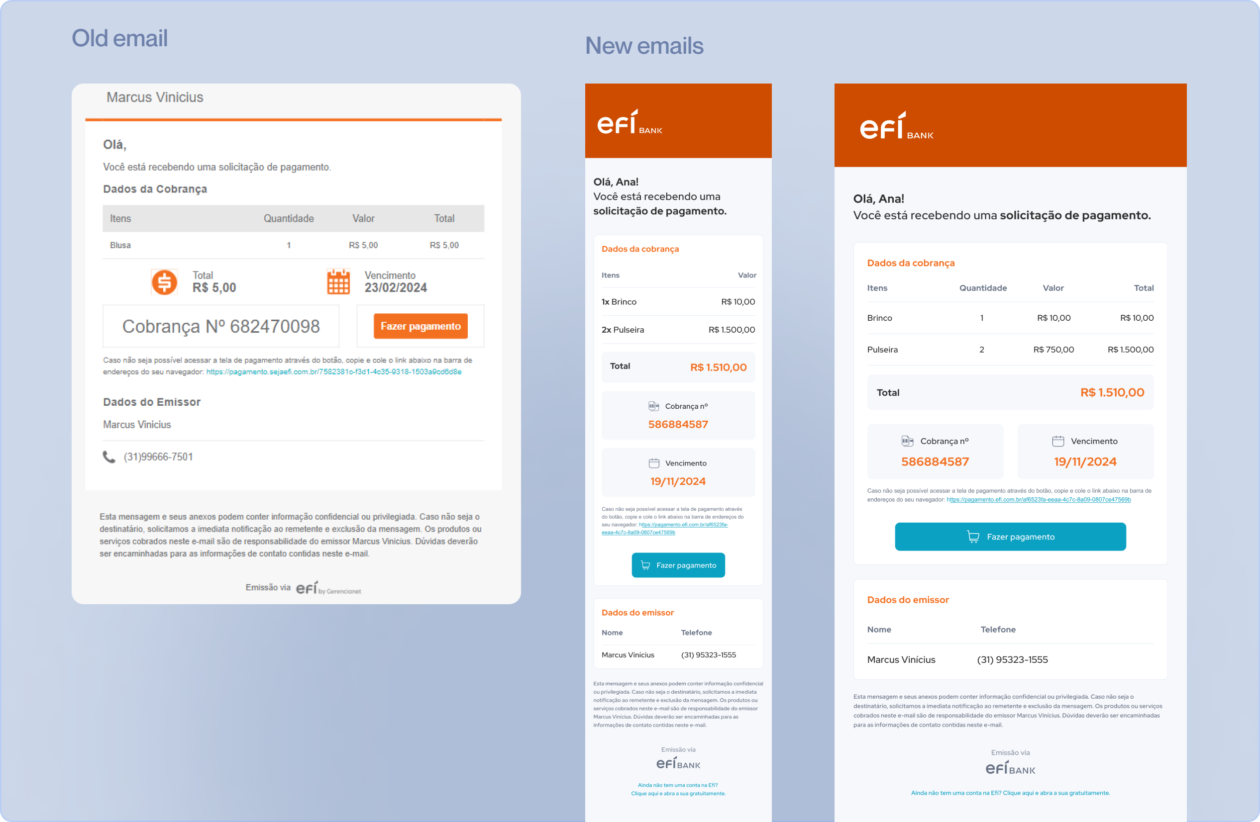
Previous version e-mail - v.6
Previous version e-mail (v.6)

Main Goals

Initially update the payments link and e-mails to v.7 (visual standards, components, interactions, colors, information architecture, etc).

Build the entire flow and new components in Figma for alignment purposes and ease of access for the design team.

Create flows and components in web and mobile versions (v.6 was web only).

In handoff process, ensure quality of implementation, considering Pixel perfect of the designed layout.

Process


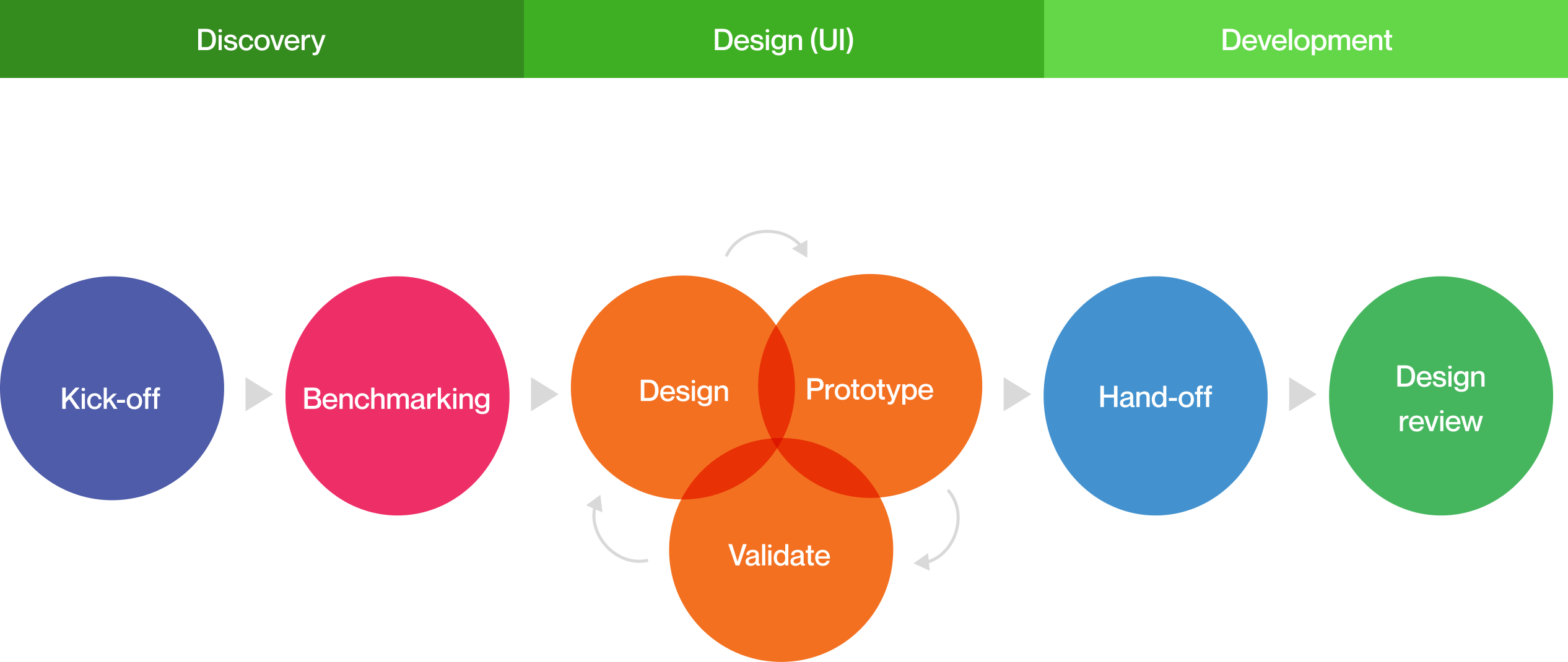
I followed a non-linear process, so I had the flexibility to work on several phases simultaneously. We had some surprises during the ideation phase, which I will explain below.

Ideation

 
After a few meetings, i was instructed to start the design and prototyping considering  the same content and representations (error, approved, under analysis, etc.) already applied to the current payment links.
 
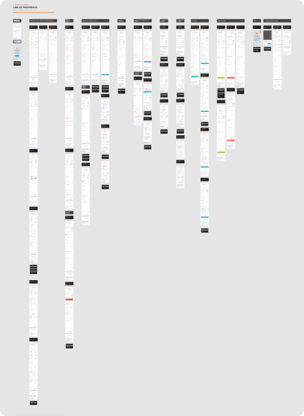
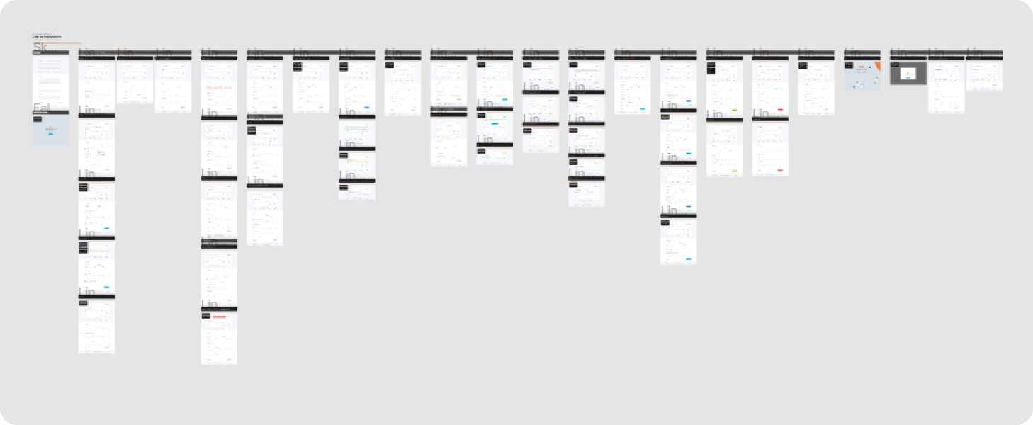
I conducted an complete analysis of our e-mails and payment link flows, as well as other competitors’ payment link flows.
 
In addition to the flows, it was also important to map the e-mails that are sent by the system.
Competidor analisys

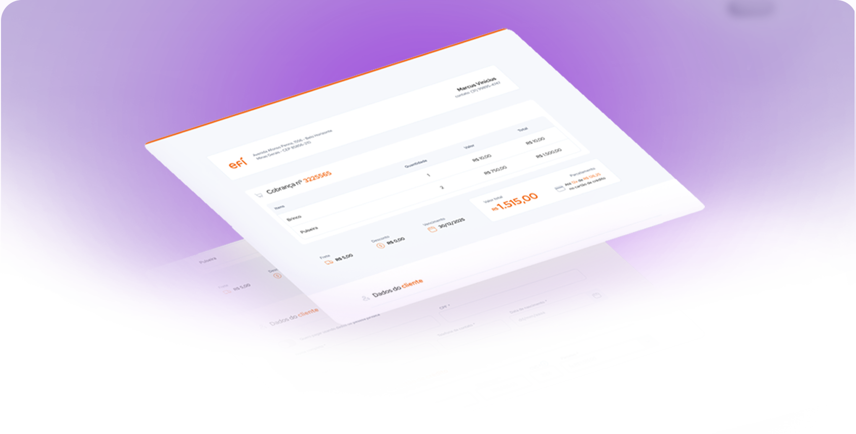
New layout (e-mails and flows)


Now understanding the flow to be updated and the complexity of the work, I started hi-fi prototyping to save time for delivery. This was the first proposal presented: 

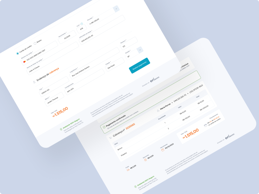
First web and mobile flows
First web and mobile version of the payment link flows
First web and mobile flows
First web and mobile version of payment link e-mails

Feedbacks

After the ideation, this first layout was presented, and the team really liked it. I received some feedback from designers and software engineers that were very important in reaching an excellent final result. Some of them:

Also design screens representing those that do not have the company logo or name.

Adjust the “installments” field to: “1x of $XX, 2x of $XX”.

There were also suggestions for adjustments to some content.

Perform some color variation tests (custom versions).

Create proposal for the top of the e-mail without an illustrative image.

Add a link or button that allows the recipient to open an account.


Adjustments applied


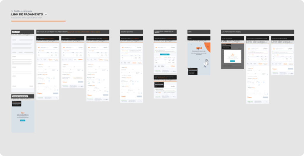
I worked on these and other adjustments not mentioned, also adding approved screens, errors, payment under analysis and other feedback screens.

Adjusted flow

Company e-mails


In addition to products with payment links, we realized that the visual update would also extend to company-wide e-mails.
 
To validate the new e-mail layout, it took several brainstorming sessions considering the new layout already designed, also involving the design team, CX and PM’s from other products.
All adjustments, even if minimal, have been documented
Company e-mails - mobile and web versions
Mobile e web versions - Approved version of the company's new e-mail (with the colors of the Efí bank account types at the top)

Therefore, all e-mail versions of the payment link that the system triggers are designed:

web-version
Web version
mobile-version
Mobile version

Flow evolution


Screens were being added to the web and mobile flows.

Mobile flows
Mobile flows
Web flows
Web flows


Some screens added

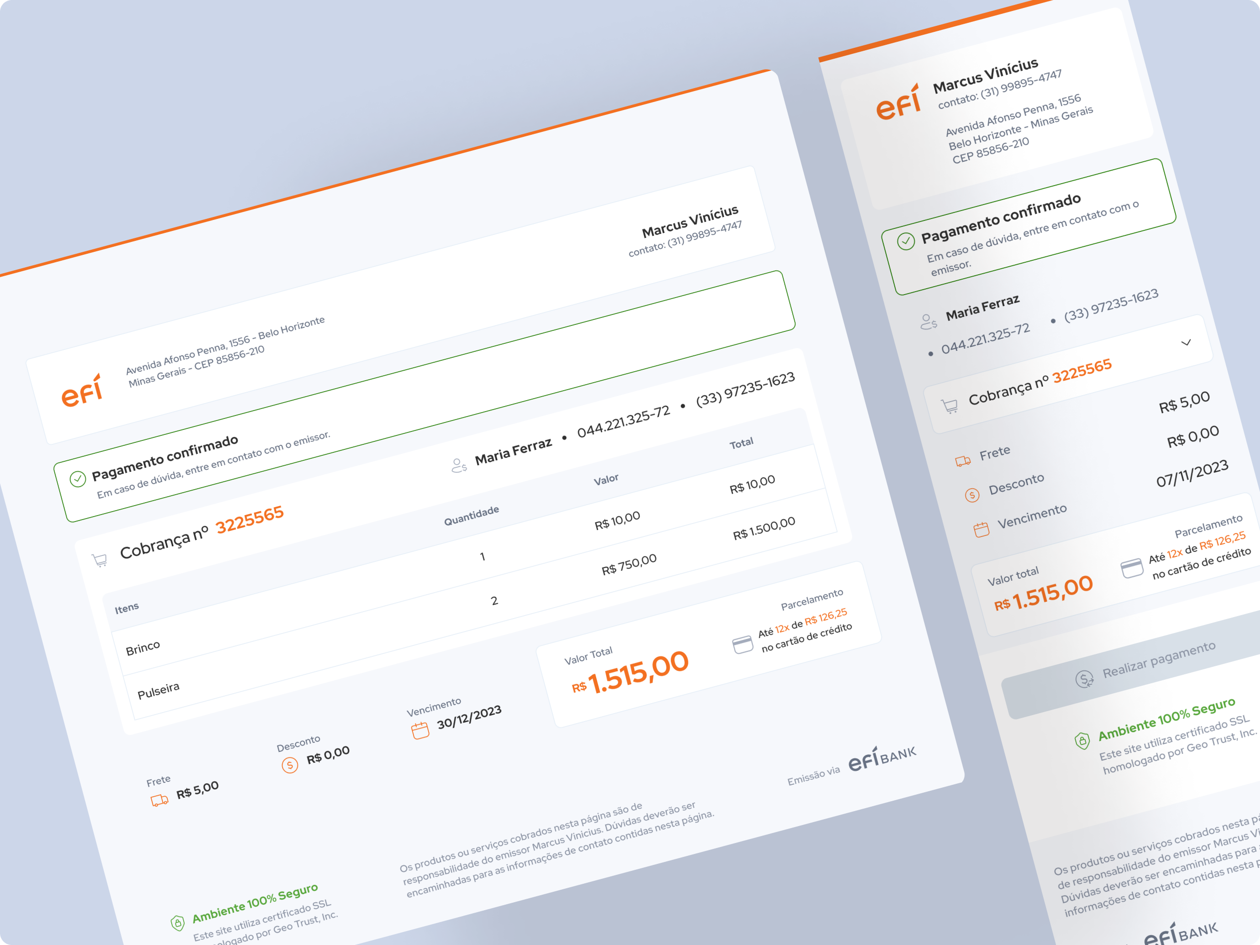
Approved payment screen
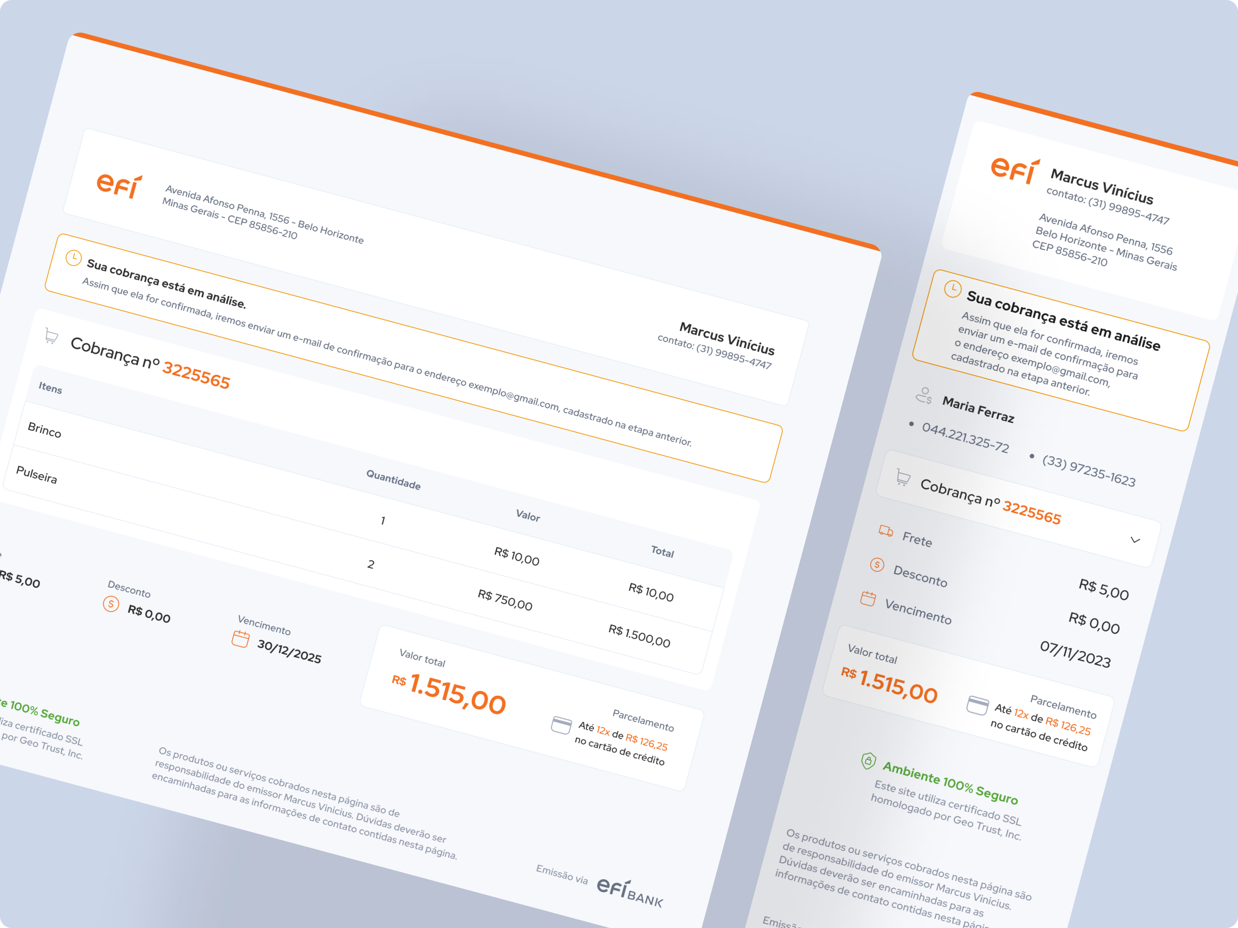
Payment screen under review
Unauthorized payment screen

Bill flow


From the beginning I understand that because there were two products that go together, I would also need to design the bill’s flow. Some of these screens:

Filled and unfilled
Filled and unfilled flow
Successfully generated bill screen


Wow: Two big challenges!

Just like the company e-mails, the update of flows extended to other products that include the 
e-commerce card, such as Recurring Payments and Payment buttons.


The handoff must contain the delivery of the update of these 3 products + e-mails so that the update is very robust.

At Efí the team normally works with web and mobile screens.


After alignment meetings, the front-end team identified that, in this case, because it was responsive, an intermediate screen would be necessary so that there would not be a huge difference between the web and mobile breakpoints.

Therefore, I needed to restructure and deliver Tablet representations, in addition to web and mobile ones.

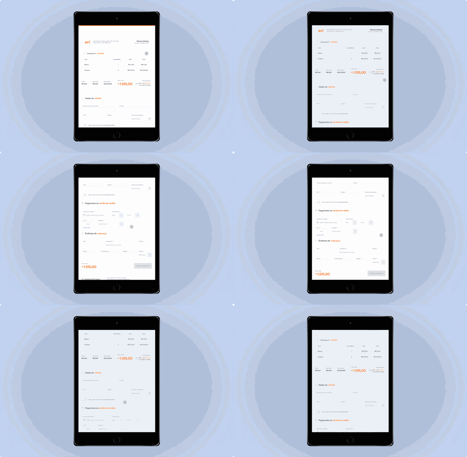
Tablet flows


In the case of the tablet versions, I preferred to build their components from scratch and not just adapt them. This ensured more independence between the web, tablet and mobile versions.

Tablet version
Tablet flows
Tablet flows


Recurring payment


In recurring payments, I went through all the v6 screens and identified that the difference for the payment link is the display of data such as plan, frequency and repetitions.

Recurring payment v6
Previous version Recurring payment (v.6)
Previous version e-mail (v.6)
Recurring payment new visual
Recurring payment new visual (already with tablet version)

Recurring payment e-mails


And of course, I also need to design the e-mails that will be sent through the recurring payment product in v7.

Recurring payment new e-mails
Mobile e web versions - Recurring payments e-mails


All e-mail versions of the Recurring payment that the system triggers have been designed. The look remains the same but the type of email does not, it was necessary to understand the types of e-mails that are sent:

web version recurring payment
Web version
mob version recurring payment
Mobile version

Payment buttons


In payment buttons, there are 2 types: payment link and recurring payment, after analyzing the v6 screens, I noticed that some information is different, there is no expiration on the generated link and the customer has the option of adding a delivery address.

Previous version Recurring payment (v.6)
Payment Button new visual (recurring payment)

Deliveries


Let’s recap: The deliveries made to the development team were:

Payment link flows (Web, Tablet and Mobile)


Payment link e-mails (Web and Mobile)

Recurring payment flows (Web, Tablet and Mobile)

Recurring payment e-mais (Web and Mobile)

Payment buttons flows (Web, Tablet and Mobile)

Handoff


The fifth month was specifically about meetings with the development team. 

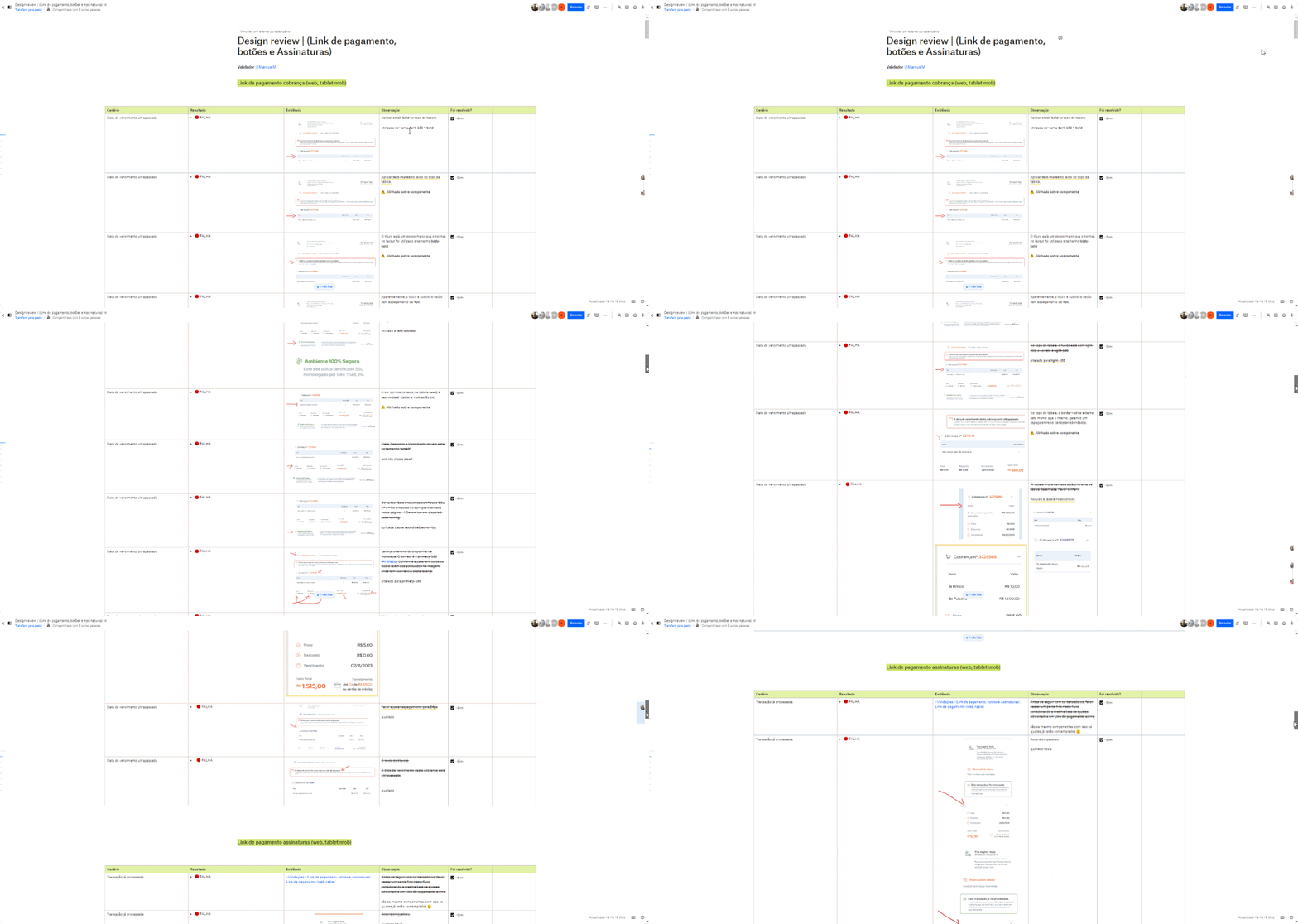
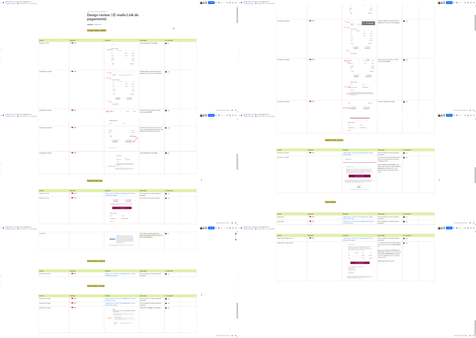
After the implementation, I finalized my process by applying 2 stages of Design review to analyze 

whether there were points that needed adjustments, ensuring Pixel perfect delivery.

Design review 1
First stage, Design review of flows (Payment link, Recurring payment and Payment buttons).
Design review 2
Second stage, Design review of the e-mails (Payment link and Recurring payment).

Learnings & opinions

Project manager aligned

The task escalated, so i needed to deliver more than was originally planned. It was very important to keep the project manager always aligned with all progress so that he could help define its delivery.

Some changes

I didn’t really expect on there being a tablet version.
To speed up and not extend our deadlines, I held several individual meetings with the Devs and this was crucial to achieving our objectives.

Design review

Sometimes due to the pressure of delivering the task quickly and seeing the system online, the Design review part ends up being left aside. Even with adding new products to the task, i was glad i didn’t skip this process.

Organization first

I started working on the Payment Link flow using componentization processes in the flows and organizing everything in every detail. 

This practice helped me a lot to scale and reuse to create the Recurring Payment and Payment Buttons flows. So, organization first.

New knowledge

To understand some contexts, i needed to study the payment model
e-commerce.

This helped me separate what Recurring Payment, Single Payment and Payment Buttons were, it was a very interesting learning experience.

Development team

It is very important to consider that the development team also has its own processes.

So, for example, if delivery must be made in 3 months, it is interesting to deliver your task well before the deadline.
 

Next steps


The next steps will be to Track metrics and work on Customer needs and Improvements (the product is alive, so improvements always continue). 😁

Marcus Martins

Let's talk about how transform ideas into real solutions?

Designed by Marcus Martins | 2024 © All rights reserved.

error:
en_US
Scroll to Top